Sunday, February 7, 2010

The Block Magazine - Redesign

This project required me to take the existing publication “The Block” and redesign the masthead, folios, and the layout of one article. The masthead was redesigned to have more impact and the ‘O’ was outlined and placed in a block to play with the publication’s name. To redesign the article we were required to create an opening spread and one subsequent spread. While the project required redesign, it also required that I kept the general feeling of the magazine.
    Created using Photoshop, Illustrator, assembled in InDesign. 
    Original photography by Lee Tourigny.

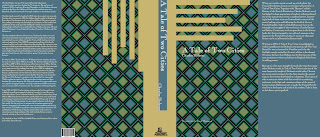
Classic Book Jackets

The purpose of this project was to create book jackets for a book series. The jackets could not have any illustrative elements, the focus of the project was typography. We were also allowed to use line and shape as design elements. Each jacket would be used multiple times throughout the series. Three jackets were designed as examples. Titles were chosen to show how long, medium, and short title lengths would appear on the book jackets. Each jacket example had to be different but still convey the idea that they were part of a book series.

Doctor Sigmund Cornelius' Cards of Language - Packaging

When assembled these two pieces become the packaging for Doctor Sigmund Cornelius' Cards of Language - English/French Edition.  The box is designed with references to Victorian Era labeling to match the cards' steampunk theme.  Each flash card would feature a different illustration of the same item on each side.  Each side also has the item's name in English or French to allow for easy learning and later for quizzing.

Doctor Sigmund Cornelius' Cards of Language - English Side of Cards

Each of these items are designed as the front of flash cards for learning English or French.  These cards feature illustrations and the item's name in English.  The illustrations and typeface are designed in a steampunk theme.

Doctor Sigmund Cornelius' Cards of Language - French Side of Cards


Each of these items are designed as the back of flash cards for learning English or French.  These cards feature illustrations and the item's name in French.  The illustrations and typeface are designed in a steampunk theme.

North American Midway

These four posters were designed to promote a fictitious documentary series for a television network like A&E. Each poster carries a unique headline and image. The headlines all relate back to the viewer and memories they have of going to the midway/carnival.
    The images are night shots to show the lighting of each of the attractions featured in each poster. The colouring of the letters also reflects the bright colours of the midway. Each poster is 10”x12” and were designed using Adobe Photoshop and Adobe Illustrator. 
    Photography used in campaign is stock photography.

Leave the Everyday Behind - Part 2


The second part of this project was designing the stationary for Noble Hare Wines, which can be seen above.  The business card is double sided featuring the logo with general contact information which would appear on all cards while the other side is custom designed with more detailed information and could appear in a number of different colours.  The background on the card front and back was chosen to simulate the visual texture of cork.  The Envelope and letterhead designs use a transparent gradient in order to tie them in with the magazine advertisement and the bright colours found on the business cards.  All components were designed in Adobe Illustrator.