Sunday, April 11, 2010

Grey Goose Vodka - Food Styling Photography

In this project I was tasked with recreating the photography used in a advertisement featuring food styling. The product I chose was Grey Goose Vodka. For this project we were required to recreate the lighting and appearance of the product. By reflecting the light I was able to recreate the soft highlights visible on the bottle and the glass.
    Food styling and original photography by Lee Tourigny.
 

Designer's Alphabet Book

This project’s goal was to create an alphabet book based on design terms. The cover’s illustration was designed as children’s blocks featuring symbols familiar to graphic designers. I chose Helvetica because of it’s clean lines and wide use in the design world.
    Each Opening spread is designed to display the letter and one word starting with that letter. I chose design words that had a second meaning and illustrated the second meaning. i.e. a James Bond figure shown with the word alias.
    Subsequent spreads would show design words with their definitions, while the word that appeared on the opening spread would have the non-design definition.
    The colours chosen for the book are bright and have a high level of contrast in order to make the book attractive to a younger audience. However, the copy is meant for an older audience, making this a piece that would spark someone’s interest if it was sitting out on a coffee table.


MUOTO - Magazine Covers

For this project I was required to create 3 covers for the magazine MUOTO. Each piece had to have a different masthead and execution.
    I went for a more geometric and monochromatic approach. Each rectangle is the same colour with different levels of transparency. To further emphasize the cover artwork the feature articles are overlayed on the masthead.
Original illustration by Lee Tourigny.
    This cover places the feature articles higher in the hierarchy, than the masthead, which is placed at the bottom of the cover.
Stock illustration was used on this cover.
    This cover brings the masthead back to a larger size, but places it towards the bottom, to bring more attention to the feature stories. A solid colour background is also used in order to bring more focus to the masthead and the feature stories.

Icon Magazine Launch Party - Poster

This poster was designed to promote the fictional launch of a monthly editorial focusing on music and fashion in the Los Angeles area.
    This poster would be seen at the launch party for the magazine, allowing guests to know they have the correct location. It may also be seen inside of the event.
    The theme ‘Expecting Static Showers’ was chosen because of Hollywood and the Television industries’ influence on the Los Angeles area, along with the deserts of California. The television was also chosen for this reason.
    The masthead was supplied by the teacher. Stock photographs were manipulated to create an original image for the poster.


Fur Trade - Event Promotion

Poster and Banner designed to promote The Canadian Museum of Civilization’s exhibition on the fur trade, “The Canadian Fur Trade • Profit & Ambition, 1779-1821”
    The poster was designed to promote the exhibit and inform the viewer of the location, dates, and admission prices. The illustration of a beaver was chosen because of its iconic place in Canadian history and its easy association to Canada’s fur trade.


    The banner was designed to be hung from the curving exterior walls of the museum. As a result of theses curves a scene depicting a canoe of fur traders was used to simulate a flowing river. This piece did not require location or pricing information because viewers would already be at the museum, and is meant to promote the exhibit to people already planning to visit the museum.


    Both the poster and the banner contain similar elements. Colours chosen for both were selected for their aged and weathered appearance. The background in both also features a map of Canada, used as texture. The logo was designed to promote the french heritage of the fur traders featured in the exhibit. The type for the logo was modified in order to create the illusion of being written with a quill pen. The typefaces used for other information were chosen for their legibility.
    All components designed and assembled within Adobe Illustrator.

Chocolate Addiction - Rebranding

Chocolate Addict is a chocolatier located in Toronto’s Kensington Market. Known for their unique truffle flavours, this shop is very memorable. Their current logo and atmosphere, currently fits with the Kensington Market. However, when compared to the design of its competition it feels cheesy and of a lower quality. This rebrand was done in order to enhance the brand, and promote it as a high quality chocolatier.
    The logo is designed using a script and an italic Helvetica. The ‘C’ and ‘A’ were done in script to flow with the lines used on the new packaging and to allow for promotional items to be monogrammed with a recognizable symbol. The browns were chosen for their richness and easy association with chocolate.
    The banner is designed to appear instore and promote the new atmosphere. The slogan, “welcome to the new addiction” promotes the brand and the store’s new atmosphere.
    The post card is meant as a promotional device that can be used as a direct mail piece to either loyal customers, or a new target audience.
    The packaging is a rich brown, tying it to the store’s new appearance and atmosphere. It uses swirls to promote an elegance and simulate fresh chocolate being poured.
    Designed using Adobe Illustrator and InDesign.

Trademarks

Jazz Club - Second Hand Jazz
Regarding the design for Second Hand Jazz, hand drawn type was chosen to evoke feelings of energy and a roughness. This was done to give the person on the street the idea that this club plays more energetic and fast paced jazz as opposed to smooth jazz.

Restaurant - London Fog Gastro-Pub
The design for London Fog was chosen to promote the idea of a British Pub with a focus on food. The derby hanging on the ‘g’ was placed to appear hanging, and is in reference to Winston Churchill’s iconic hat.

Film Festival - Unaligned Independent Film Festival
The name Unaligned was chosen to further the idea that this was an independent film festival. The word is used here to say that these films are not aligned with any major studios and have a unique outlook. The type in the logo was cut and shifted to also play with the name of the festival, essentially dis-aligning the type.


Airline - Odyssey 
Odyssey was designed with the idea of journey and flight. The blue wisps behind the company name represent flight and the beginning of your journey.


Private School - Future Endeavors 
Future Endeavors is imagined to be a private pre-
school focused on the building blocks of education. To convey this the logo uses the image of letter-blocks and a typeface that evokes an educational atmosphere.


Hair Salon - Headcase Salon
Headcase is a play on words conveying the idea of unique and avant-garde hair design. The type is arranged in a jumbled way also playing with the word’s actual definition.


Catering Company - Indulgence Catering
To evoke an idea of elegance and simplicity this logo was designed in a straight forward manner. The type was chosen for it’s elegance and richness. The ‘I’ was done in a more handwritten typeface to tie the illustration of a fork into the logo.


Bike Shop - Bent Sprocket 
Bent Sprocket’s logo was designed to fit in with a city’s downtown area, such as North Bay or Huntsville. The name was chosen to convey the message that the shop does bike repairs. The B was chosen to evoke feeling of simpler times and with the idea that this logo would appear as a wood carving at the store. The rest of the letters are crashed together and the logo’s illustration are designed as if they have been in an biking accident.


Record Company - Up 2 Eleven Recording 
Why Up 2 Eleven? Because Eleven is is louder than ten! The name of this company is inspired by the movie ‘This is Spinal Tap.’ This recording company specializes in rock and metal acts with a name to reflect the volume enjoyed by many of their listeners. The logo is designed with only two colours to allow for easy reproduction of the logo on promotional items.


Publishing Company - Stovepipe Publications 
The illustration of the beat-up hat and the name Stovepipe were chosen to show that this publishing company mainly publishes books of a Dickensian nature.

Sunday, February 7, 2010

The Block Magazine - Redesign

This project required me to take the existing publication “The Block” and redesign the masthead, folios, and the layout of one article. The masthead was redesigned to have more impact and the ‘O’ was outlined and placed in a block to play with the publication’s name. To redesign the article we were required to create an opening spread and one subsequent spread. While the project required redesign, it also required that I kept the general feeling of the magazine.
    Created using Photoshop, Illustrator, assembled in InDesign. 
    Original photography by Lee Tourigny.

Classic Book Jackets

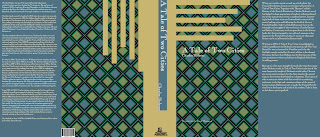
The purpose of this project was to create book jackets for a book series. The jackets could not have any illustrative elements, the focus of the project was typography. We were also allowed to use line and shape as design elements. Each jacket would be used multiple times throughout the series. Three jackets were designed as examples. Titles were chosen to show how long, medium, and short title lengths would appear on the book jackets. Each jacket example had to be different but still convey the idea that they were part of a book series.

Doctor Sigmund Cornelius' Cards of Language - Packaging

When assembled these two pieces become the packaging for Doctor Sigmund Cornelius' Cards of Language - English/French Edition.  The box is designed with references to Victorian Era labeling to match the cards' steampunk theme.  Each flash card would feature a different illustration of the same item on each side.  Each side also has the item's name in English or French to allow for easy learning and later for quizzing.

Doctor Sigmund Cornelius' Cards of Language - English Side of Cards

Each of these items are designed as the front of flash cards for learning English or French.  These cards feature illustrations and the item's name in English.  The illustrations and typeface are designed in a steampunk theme.

Doctor Sigmund Cornelius' Cards of Language - French Side of Cards


Each of these items are designed as the back of flash cards for learning English or French.  These cards feature illustrations and the item's name in French.  The illustrations and typeface are designed in a steampunk theme.