Jazz Club - Second Hand Jazz
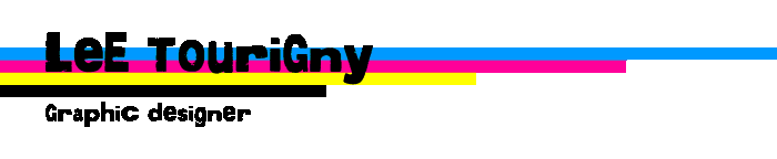
 Regarding the design for Second Hand Jazz, hand drawn type was chosen to evoke feelings of energy and a roughness. This was done to give the person on the street the idea that this club plays more energetic and fast paced jazz as opposed to smooth jazz.
Restaurant - London Fog Gastro-Pub
 The design for London Fog was chosen to promote the idea of a British Pub with a focus on food. The derby hanging on the ‘g’ was placed to appear hanging, and is in reference to Winston Churchill’s iconic hat.
Film Festival - Unaligned Independent Film Festival
The name Unaligned was chosen to further the idea that this was an independent film festival. The word is used here to say that these films are not aligned with any major studios and have a unique outlook. The type in the logo was cut and shifted to also play with the name of the festival, essentially dis-aligning the type.
The design for London Fog was chosen to promote the idea of a British Pub with a focus on food. The derby hanging on the ‘g’ was placed to appear hanging, and is in reference to Winston Churchill’s iconic hat.
Film Festival - Unaligned Independent Film Festival
The name Unaligned was chosen to further the idea that this was an independent film festival. The word is used here to say that these films are not aligned with any major studios and have a unique outlook. The type in the logo was cut and shifted to also play with the name of the festival, essentially dis-aligning the type.
Airline - Odyssey
Odyssey was designed with the idea of journey and flight. The blue wisps behind the company name represent flight and the beginning of your journey.
Private School - Future Endeavors
Future Endeavors is imagined to be a private pre-
school focused on the building blocks of education. To convey this the logo uses the image of letter-blocks and a typeface that evokes an educational atmosphere.
Hair Salon - Headcase Salon
Headcase is a play on words conveying the idea of unique and avant-garde hair design. The type is arranged in a jumbled way also playing with the word’s actual definition.
Catering Company - Indulgence Catering
To evoke an idea of elegance and simplicity this logo was designed in a straight forward manner. The type was chosen for it’s elegance and richness. The ‘I’ was done in a more handwritten typeface to tie the illustration of a fork into the logo.
Bike Shop - Bent Sprocket
Bent Sprocket’s logo was designed to fit in with a city’s downtown area, such as North Bay or Huntsville. The name was chosen to convey the message that the shop does bike repairs. The B was chosen to evoke feeling of simpler times and with the idea that this logo would appear as a wood carving at the store. The rest of the letters are crashed together and the logo’s illustration are designed as if they have been in an biking accident.
Record Company - Up 2 Eleven Recording
Why Up 2 Eleven? Because Eleven is is louder than ten! The name of this company is inspired by the movie ‘This is Spinal Tap.’ This recording company specializes in rock and metal acts with a name to reflect the volume enjoyed by many of their listeners. The logo is designed with only two colours to allow for easy reproduction of the logo on promotional items.
Publishing Company - Stovepipe Publications
The illustration of the beat-up hat and the name Stovepipe were chosen to show that this publishing company mainly publishes books of a Dickensian nature.
 Regarding the design for Second Hand Jazz, hand drawn type was chosen to evoke feelings of energy and a roughness. This was done to give the person on the street the idea that this club plays more energetic and fast paced jazz as opposed to smooth jazz.
 The design for London Fog was chosen to promote the idea of a British Pub with a focus on food. The derby hanging on the ‘g’ was placed to appear hanging, and is in reference to Winston Churchill’s iconic hat.


